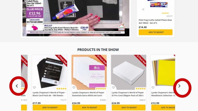
For months now, some customers of Create and Craft TV have been frustrated due to the navigation on the website.
Some indicated that they have posted their frustration on Create and Craft TV’s website but nothing seems to be done or it was assumed as moaning.
Due to this frustration, many have decided to not shop since most of them use their phones when ordering from the website.
We took a look at the customer’s feedback and decided to understand the issue by sending it to some first -times and different age groups with less computer(internet)knowledge to navigate the site.
Well, the customer is right.
According to feedback from some customers, A grid view where products available in the same show should be seen and not hidden under a SCROLL RECT “triangular icon” because it is difficult for some to do that and add the items to their basket.
We hope Create and Craft TV will heed the concerns of their customers and rectify this!
Link: https://createandcraft.com/


